Logo
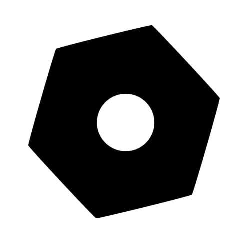
I have been trying to make a logo for the Orchard.
At first, I imagined the cross-section of a pencil: a small centre held within wood, the wood given a six-sided boundary. It seemed appropriate. A pencil is an instrument for making a personal mark, and the Orchard is made from such marks—sentences, photographs, observations, things noticed and set down.
Then the pencil became a tree.
Seen from above, there was a round trunk, a hexagonal crown and a circular wall enclosing it. A tiny orchard reduced to geometry. Not a picture of a particular tree, but perhaps the sign for a place where trees are tended.
Then it became a well.
The same shapes could be the view from above: a six-sided stone opening with darkness or water at its centre. That changed the direction of attention. The tree grew upward and outward. The well invited the eye downward. Yet both asked someone to pause at the boundary and look in.
After that, inevitably, it became a nut.
Not the sort that grows on a tree, but the sort that accompanies a bolt. The mystical well had turned into hardware.
This did not feel like a failure of symbolism. The Orchard has always had a socket wrench lying somewhere near its phenomenological theology. Relationships may be mysterious, but they also need adjusting. Sometimes something is loose. Sometimes two parts need a fitting that allows them to hold together without becoming the same part.
I remembered a small booklet called Good Flag, Bad Flag. A good flag should be simple enough to recognize at a distance and distinct enough to remember. I also thought of Japanese mon: household marks that can be printed, stitched, carved or drawn. They do not require a paragraph beside them to begin doing their work.
That gave me another test. Would the Orchard mark remain legible when reduced to the tiny icon on a browser tab?
It did.
At that scale, the pencil, tree, well and nut disappeared. No one could be expected to identify any of them. What remained was the relationship: a boundary, a six-sided structure and a centre.
Perhaps that is enough.
A mark does not have to settle what it means. It can provide a precise frame around an alive gap. One person may see something growing. Another may see somewhere to look. A third may reach for a spanner. The mark holds steady while its meanings continue to participate.
In German, logo is also a slang shortening of logisch: logical, obvious, of course.
I had thought I was choosing among four different pictures. Instead, I had been looking at the same mark from four directions.
Pencil, tree, well or nut.
At the smallest scale, none of them—and unmistakably itself.
Logo.